(Past Client)
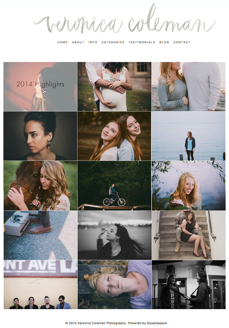
Veronica simply wanted a little site love… a pick-me-up so to speak. She felt her current theme didn’t have enough interaction when potential clients looked around, so I added an opacity transformation to the thumbnails and brought out the post’s name at the same time. It looks elegant and much more informative. Even small touches like this can make a big difference.
